")
Crafting Emotion Through Color in Interiors
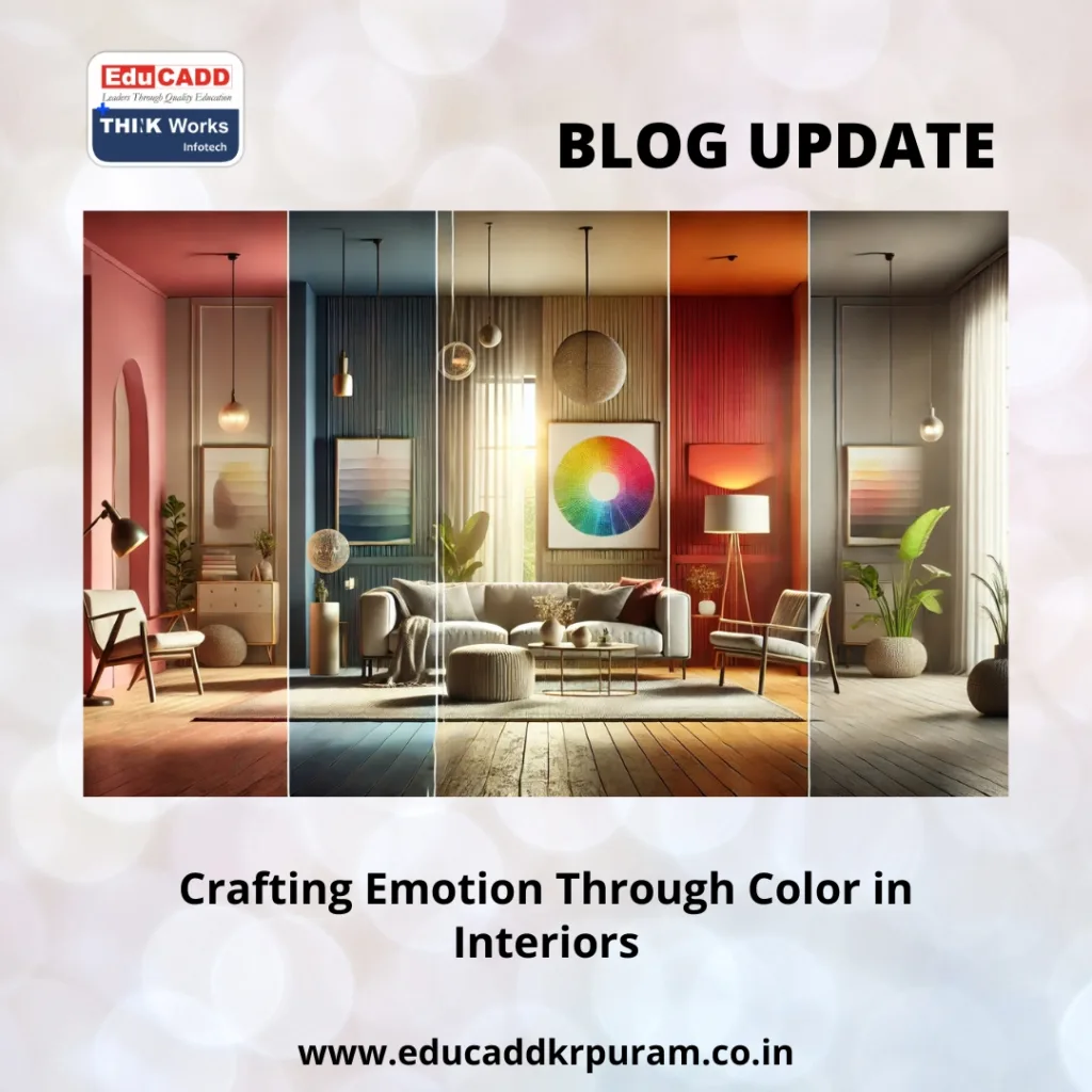
Color shapes how we feel, think, and even act in any given space. In interior design, selecting colors is far more than a decorative choice—it directly impacts mood, energy, and functionality. Emotional Interior Color Design has emerged as a critical tool for designers aiming to create environments that resonate emotionally while serving practical purposes.
Emotional Interior Color Design
A well-designed interior combines style with science. Each shade can evoke excitement, tranquility, or focus. Bedrooms painted in calming blues promote rest, while kitchens with vibrant yellows stimulate energy. In this guide, we explore the science, practical applications, cultural considerations, and emerging trends of color psychology in interior spaces.
1. Understanding the Science of Color in Interiors
Colors communicate with the brain instantly, influencing emotions and physical responses. The study of Emotional Interior Color Design reveals that hues can affect heart rate, attention, and even appetite.
For example, warm tones like red and orange can increase energy levels and stimulate conversation. Cooler tones such as blue and green reduce stress and foster relaxation. Designers rely on these responses to craft spaces that are functional and emotionally engaging.
By understanding the connection between color and human perception, interiors become more than visually pleasing—they become environments that actively support well-being.
2. How Colors Influence Mood and Behavior
Emotions are deeply intertwined with color. Each hue carries unique psychological effects:
-
Red: Invigorates energy and stimulates passion, ideal for dining or creative zones.
-
Blue: Encourages calmness, focus, and serenity; perfect for bedrooms and offices.
-
Green: Promotes balance and stress relief, suitable for living rooms or study areas.
-
Yellow: Evokes optimism and energy, enhancing kitchens or entryways.
-
Purple: Adds a touch of luxury and creativity, often used in bedrooms or studios.
-
Neutral shades: White, beige, and grey create versatile, balanced backdrops that support other colors.
A thoughtful palette aligns a room’s function with desired emotional responses. Poor color choices can trigger discomfort, while strategic combinations create harmony and well-being.
3. Practical Applications in Interior Spaces
Knowing how colors affect emotions is only part of the process. Applying color psychology in interior spaces effectively ensures that every room achieves its intended purpose.
Living Rooms
These spaces thrive on warmth and social connection. Soft browns, muted reds, and beige tones create intimacy, while touches of green enhance calm interaction.
Bedrooms
A restful environment demands tranquility. Blues, soft greys, and lavender tones promote sleep and reduce stress. Avoid overly bright or warm colors that could disturb relaxation.
Kitchens and Dining Areas
These areas benefit from stimulating colors. Yellows and oranges boost energy and appetite, while neutral tones prevent overstimulation.
Workspaces
Productivity and concentration are essential here. Subtle greys, whites, and blues encourage focus, while green accents refresh and energize without distraction.
Bathrooms
Cleanliness and serenity are key. Blues, greens, and soft neutrals mimic natural elements, creating a spa-like atmosphere. Wooden textures or soft lighting can add warmth.
Strategic color application enhances both the function and emotional impact of interior spaces.
4. Cultural and Contextual Considerations
While color evokes universal reactions, cultural context shapes perception. Color psychology in interior spaces must account for regional meanings and traditions.
In India, red symbolizes prosperity and celebration, often used in living areas and festive décor. In Western countries, red can denote warning or urgency. Similarly, white signifies purity in many cultures but represents mourning in some Asian traditions.
Climate also plays a role. Cooler shades bring relief in tropical areas, while warmer earthy tones add comfort in colder regions. Combining psychological insight with cultural and environmental awareness ensures interiors resonate with inhabitants’ experiences.
5. Emerging Trends in Color Psychology
Color psychology continues to evolve with technology, lifestyle changes, and design innovation. Some notable trends include:
Biophilic Design
Natural greens and earthy shades connect interiors to nature, reducing stress and enhancing comfort.
Adaptive Lighting
Smart lighting systems allow colors to shift throughout the day, aligning with circadian rhythms. A workspace can glow in cool tones during mornings and transition to warmer hues in the evening.
Minimalist and Sustainable Palettes
Eco-conscious design favors muted, natural shades that promote longevity and timelessness.
Personalized Color Experiences
Designers increasingly tailor colors to individual preferences, ensuring that interiors support personal moods and lifestyles. Extroverts may thrive in bold palettes, while introverts may prefer soft, calming tones.
The future of color psychology in interior spaces is dynamic, combining science, personalization, and environmental awareness to create emotionally intelligent designs.
Conclusion
Colors in interior design extend far beyond visual appeal. Color psychology in interior spaces enables designers to shape emotions, influence behavior, and enhance functionality. Thoughtful application of color transforms rooms into spaces that not only look beautiful but also feel meaningful.
By understanding the emotional, cultural, and environmental implications of color, designers craft interiors that are harmonious, supportive, and unique. The right palette fosters well-being, promotes comfort, and elevates everyday experiences, turning ordinary rooms into extraordinary spaces.

